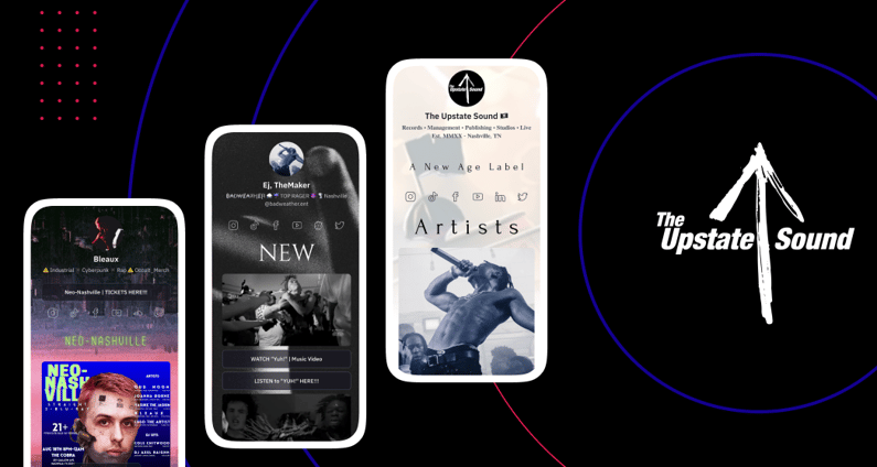
We recently sat down with David Mysliwiec, founder and CEO of Nashville-based label The Upstate Sound, to discuss how they've adopted Linkfire’s next-generation link in bio across their growing roster of artists.
Here are David’s three biggest tips for making a link in bio that stands out, drives traffic effectively, and truly represents the artist.

1. Include videos to increase engagement
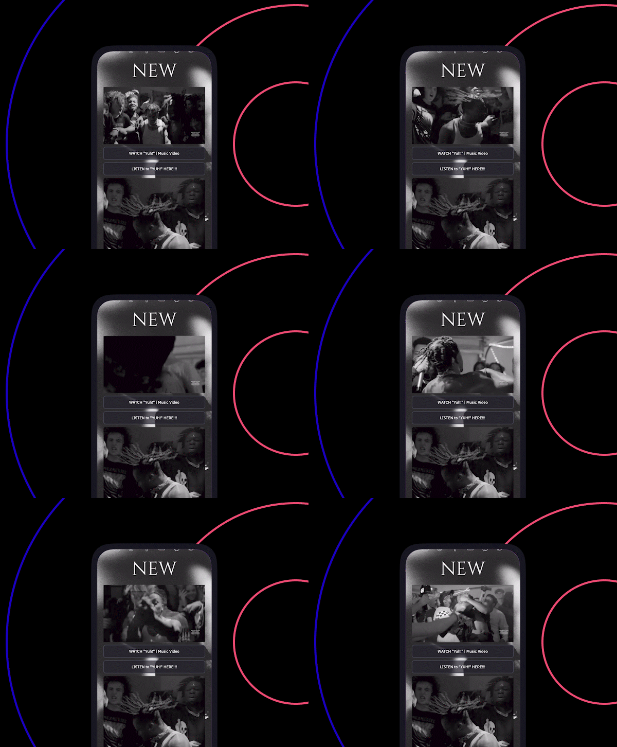
It’s no surprise that David has already seen his artists make the most of this popular new feature. Video blocks instantly amp up the visual appeal of any link in bio, and can be used to showcase a wide array of promotional assets. Whether you want eyes on your latest music video, interview clip, or tour highlights, embedding videos in your link in bio is a sure-fire way to engage fans.
David also emphasizes the importance of setting up Linkfire video blocks to auto-play. This alone can instantly transform your link in bio from feeling static to coming alive. (Note that videos are always muted by default—you obviously don’t want fans getting bombarded with sound right when they open the page.)
“I love that videos can play once the link in bio is opened. It adds movement and texture.”
2. Customize the design to match your artist brand
One of the biggest challenges for artists today is being able to stand out from the crowd. David advises artists to focus on developing a brand that truly represents them and running with it.
“Aesthetics is important in the music industry. So is fast information. A solid link in bio can do both. Using the new Linkfire link in bio, we wanted to create a unique look for each artist that matched their world.”
With our recent upgrades, Linkfire users have access to a ton of new customizations. From background images to page effects and color schemes, you can design a link in bio that’s completely unique to you.
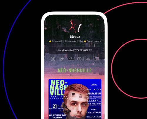
As one creative example, The Upstate Sound uses their artists’ logos as section dividers (see a live example here). This makes their branding more memorable, and also helps the entire landing page look more cohesive and professional.
“The more people see their logo, the more they’ll remember it—which could lead to ticket or merch sales in the future.”
3. Bring all of your smart links together on one page
A key advantage of using Linkfire’s link in bio is that you can bring all of your smart links together on a single landing page—and track every step of the way.
You can grow your streams and pre-saves, promote your merch, drive ticket sales, share your social media profiles, and so much more. There’s no need to prioritize one over the other—something that David and his artists also value.
“We obviously love and use the release links the most. But our artists love the ticket link! There’s always another show, so we want to make sure their fans see that first in their link in bio.”
Being able to showcase different assets allows artists and labels to get the most out of every link in bio click they receive. Using Linkfire Insights, you’ll also be able to evaluate which content is driving the most engagement, which in turn can help inform future marketing decisions.
Linkfire’s next-generation link in bio is now available to all Linkfire users. Get inspired by these five link-in-bio we love, then head over to our step-by-step guide to get yours set up.


